ITHIL
A DeFi platform that acts like a guide.
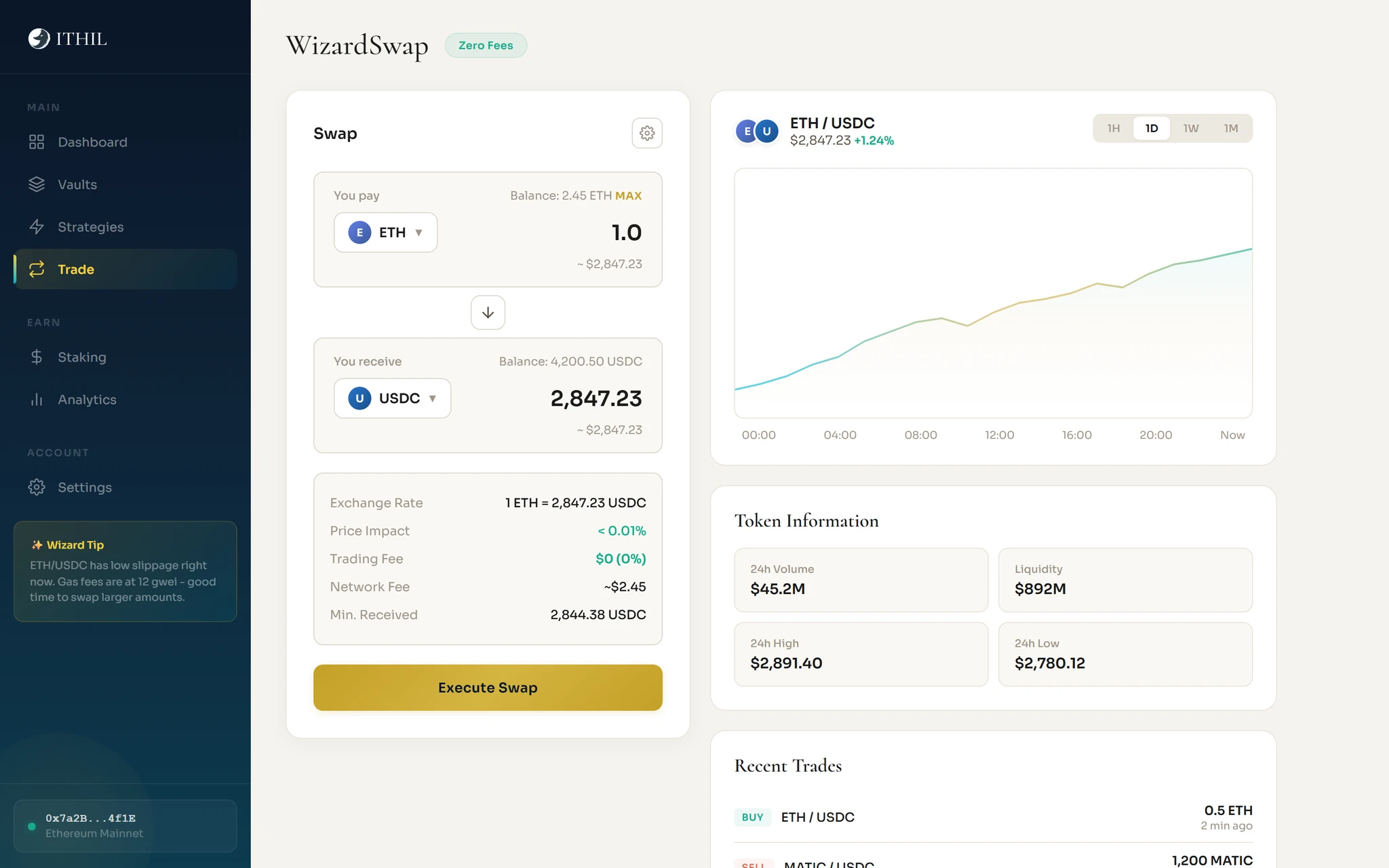
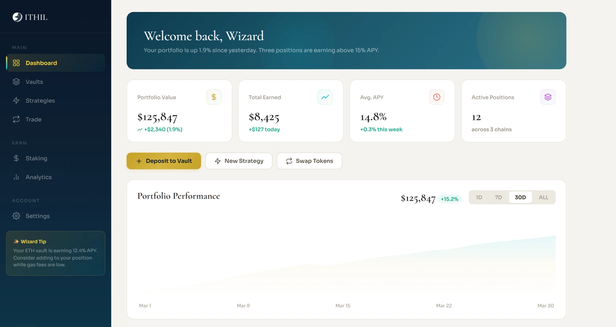
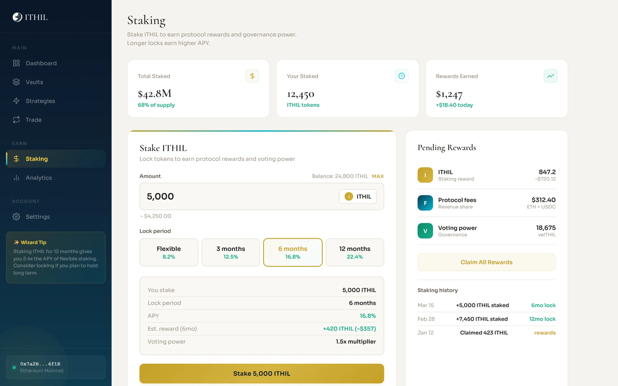
ITHIL had a name and a logo. In workshops I set its positioning, personality and voice, then designed the platform UI from the landing page to staking.



Not a cold institution. A knowledgeable friend.
The brief
The job: decide who ITHIL is and how it speaks, then carry that into five screens.
The approach
Brand first: workshops, then a brand guide. Then the platform: one user flow, wireframes and five coded pages.
The decisions
The screens


01 / 04Drag or use the arrows.
Colour
Sampled from the work. Click a colour to copy it.
What shipped
Brand strategy
Positioning, personality and voice, set in workshops
Personas and competitors
Competitor analysis. Two personas, Alex who knows DeFi and Ema who is new to it.
Brand guide
Written after the workshops, for the team
User flow
Ema's first deposit, seven steps from the landing page to the dashboard
Wireframes
Five key screens, hierarchy before visual design
Coded prototypes
Five HTML pages built from scratch, including the dashboard, vaults, WizardSwap and staking
Design system
Cormorant and Sora. Navy and gold for the site, cream and teal for the app.